


Windows 7
PaKoX


Source (link to git-repo or to original if based on someone elses unmodified work):
0.3:
- yes! Now you can use it.
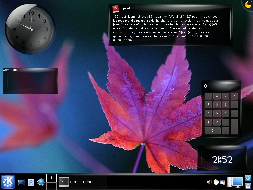
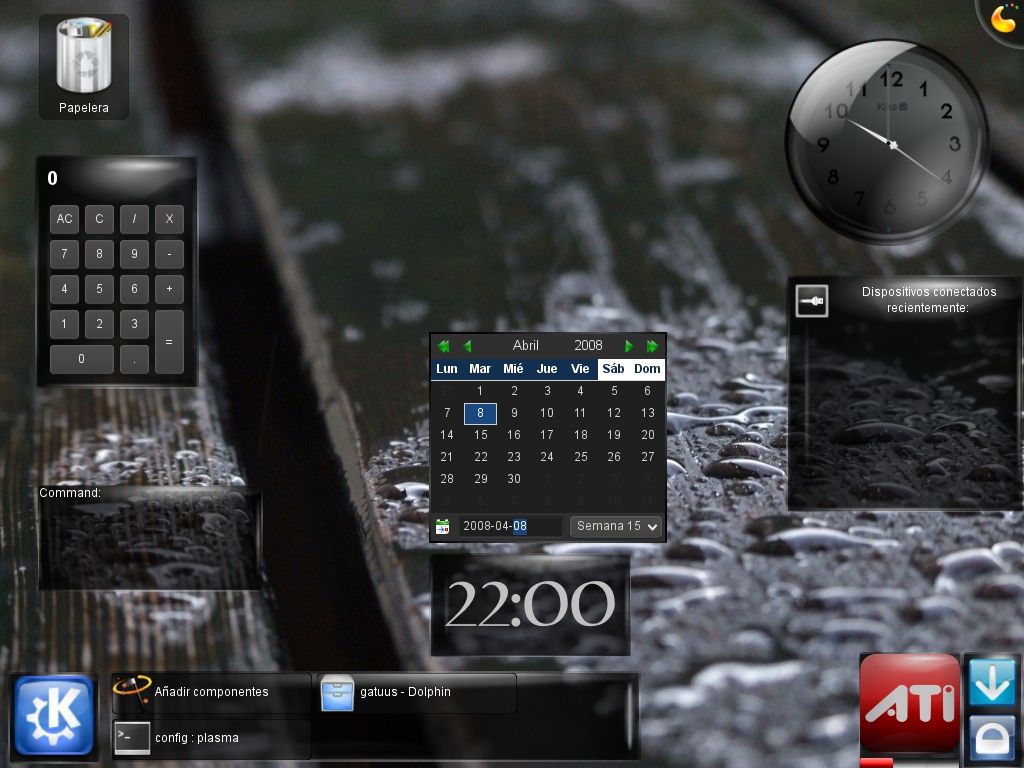
- Polished the widgets background
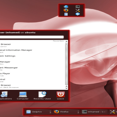
- New ATI widget theme
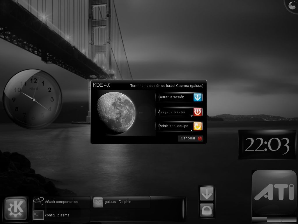
- Polished Clock theme
- New Logout theme
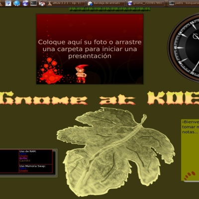
- New picture Frame theme
- Panel Theme(not very happy with this)
- Fixed 1 pixel error in background of widgets
0.3b:
- New Clock theme
- Polished the widgets background
- Still not for usage but testing!
- File only includes SVGs of background,
clock and notes
- A usable tar is coming soon!
0.3a:
Right now the file attached only includes
- the widgets background (perla)
- a new look for the "notes" plasmoid
TODO:
- Need theme for icons
- Tryied to make a task theme but failed
- Still need to polish the notes theme.
- Need to polish some widgets: picture frame, notes, panel and mmm.. panel?.
- Will try to work in Perla Roja. =)


Other Plasma Themes:
Ratings & Comments
8 Comments
I have to agree with Mobius. There are a lot of nice looking plasma themes on this site but, personally, I really think this theme stands out. Nice job!
Not sure what the brouhaha is about the clock being the only good thing. This theme is great and my current theme of choice given that I run with a dark based color theme to ease eye-strain. When I first started moving to dark background/light foreground, I had no idea how deeply embedded the black-text-on-gray-canvas thinking went... but that is a tangent for later. Thanks for providing a dark-based alternative that makes KDE4 *much* more pleasing to use... and WOW can I go off on a tangent about KDE4 (mainly Plasma) NOT being pleasing to use at this point... tangents tangents tangents
The clock looks very good. The rest of the style (IMHO) doesn't fit its quality.
Indeed, the only thing I like is the clock.
yucateco? chiapaneco? campechano? no importa... good job, i hope you finish it and it gets icluded on kde 4.1 final release... saludos
I really like this ! Please finish it !
Please, where can I get the yellow flower wallpaper we see in the screenshot? I know is part of KDE4 series, but I'm still on KDE3 and I would like to have that on my desktop. Thanks.
Thanks. I found it by myself. Bye.