
Nano
Source (link to git-repo or to original if based on someone elses unmodified work):
Available as/for:
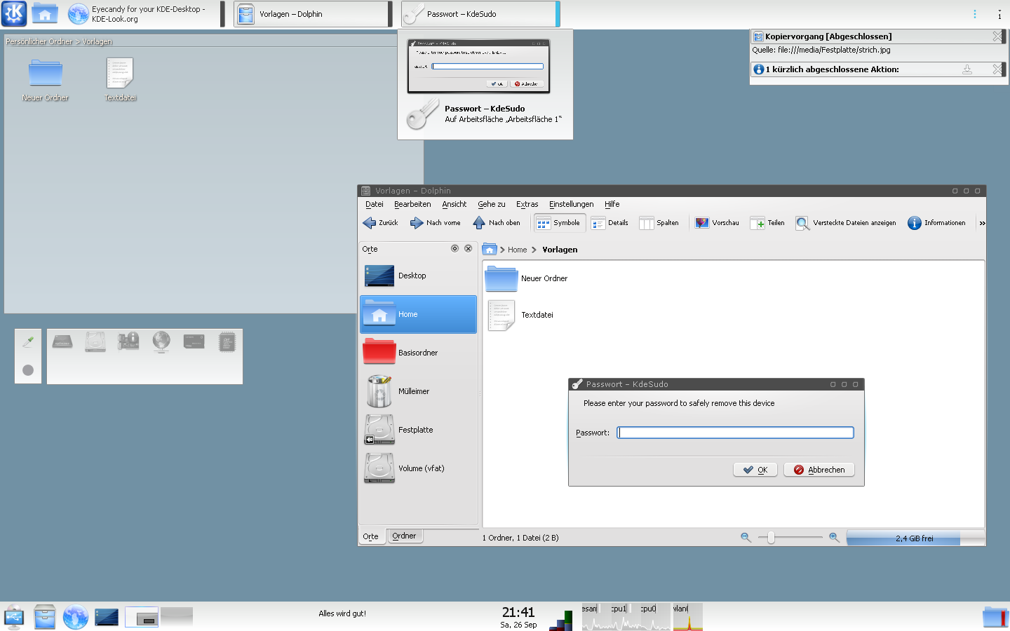
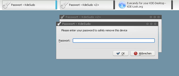
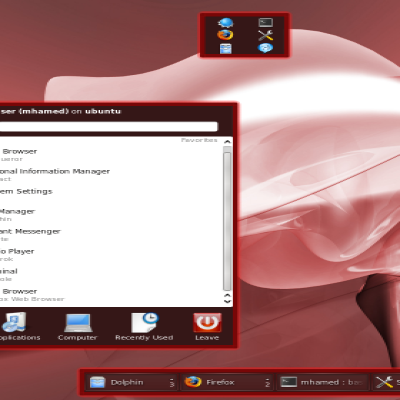
Description:This is just a port/rebuild of my favourite XP-Visual-Style, (http://customize.org/xpthemes/34699) I have used for many years.
Built it for myself. Now sharing to the world.
Please, also notice the matching Nano Window Decoration for Aurorae Theme Engine:
http://kde-look.org/content/show.php?content=112697
thankful for your opinions and suggestions,
will;
__v0.3__
- add bar_meter_horizontal.svgz, bar_meter_vertical.svgz (untested, because can't find a plasmoid using it), busywidget.svgz, calendar.svgz
- reduce left/right margin in task.svgz
__v0.2__
public release





Ratings & Comments
5 Comments
Since last few days , i've tested many plasma themes and this one is , IMO , underrated. I've find in others themes that too much transparency and too many eyes candy just kill usability : difficult to read sometimes and/or too distracting. This one look perfect , really clean. I use 'plasma netbook' for the moment , which i like. So , i really hope you'll keep this theme up. * crossing fingers *
it looks like kicker in KDE 3. Nice.
this theme is really nice. Looks professional and easy on the eyes! I want to see more themes in this style. Hope you will create some variations for us.
pretty good one. the only con - it would be better if the buttons on window titles were standard ones - [_] [O] [X]
thanks for rating, I was awaiting this buttons issue. I thought the same while building it. I try to remain as nearest as possible at the original for now. I'm sure I'll fork and customize it later with obvious buttons. will;