


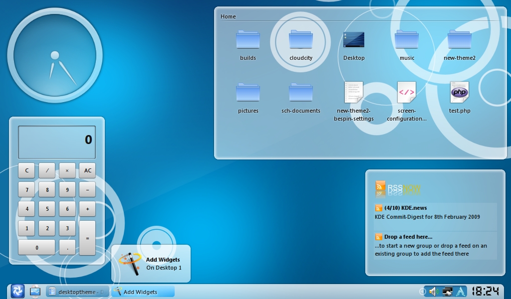
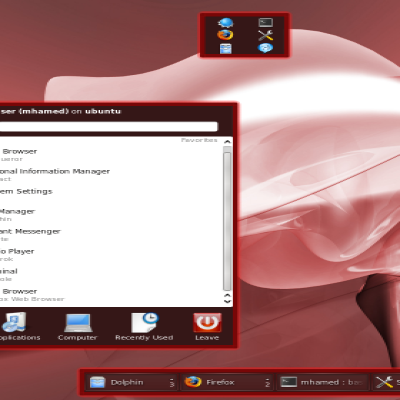
well, it's a plasma theme with the
most advanced analog clock to date (being sarcastic ofc).

I made it to fit with this wallpaper:
http://www.kde-look.org/content/show.php/Evolve+KDE+Air?content=99298
and then the bespin theme.... well check
the screenshot,
any insults welcome!
made in the gimp,compiled in inkscape.
//Robert
PS. the theme is very incomplete... so
be aware!


Ratings & Comments
35 Comments
theRob, I knew it! I have been using slickness for a while, wondered what kind of artwork would yo be creating now. So, KDE... Anyway, thanx for your job, this theme looks neat, tough atm i do not have KDE installed.
I just did a clean install of Jaunty and having issues when trying out your (or any other) theme. The rendering is not what I see in the screenshot. For instance, the plasma bar at the bottom is gray with a black border unlike the cloudy white color in your screenshot. The Glassified theme produces a dark gray color rather than transparent (just for comparison, not asking for support on that theme) Do I need to enable desktop effects or perform the installation in a special way? I am just going to "Appearance Settings" -> New Theme -> click install on your theme. Thanks, Dhaval
yeah, you need compositing for transparency on panels. As far as I know, there is no way around that. hope this helps //Robert
If only the Keramik theme were still there :( It'd match really nicely...
Glad you like it :) well bespin should match quite good also as I created this because I didn't find any plasma theme in the same style that bespin is :)
I especially like the system tray. And, I understand you, thinking of a name is hard ;)
Thx man! Yeah, it's hard to come up with a name... and after I created this, I thought "hmmm, let's upload it to kde-look" and then when I packaged it I didn't have any extra time to start tinkering what I should call it so yeah, new-theme-2 :D
I would have gone with something simple that looks (a bit) like your work. Like clouds or something. And keep up the good work. The selection of a plasma theme just got a bit harder.
Thx! the next time I update this it will be called clouds :)
Didn't include the opinion about new rev. in my message ;) It's great - so modern, soft, good-looking! Man! Awesome - I love this style! :)
Thx again man! glad you like it :D I have somehow managed to make this style to my own liking also... I just can't get it just right. I'm always changeing stuff back and forth... I'd like to have a transparent tray... tho if I do that every non-qt4 tray icon will get a nasty grey box around them.. which is not at all smooth.. so I'll doubt I'll make that happen. anyways, if you've got any ideas I'm happy to ear you :) I know this theme is very incomplete and there is a lot of stuff missing, I just want to get the base the way I want it.... might take a while :D //Robert
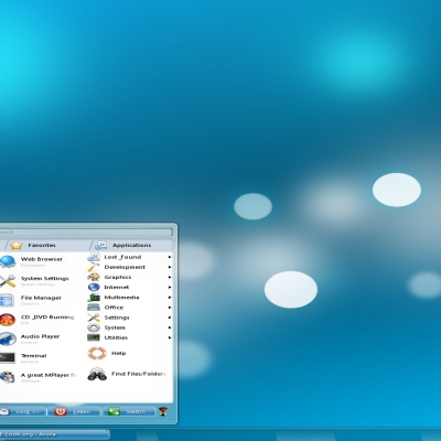
Hey, I really like your theme. I've created a Flung Plastic desktop with it on my netbook. http://www.cynapses.org/tmp/pics/netbook.png Cheers, -- andreas
Thx! glad you like it, nice shot also :) //Robert
Thx, my friend! I'm happy now :) Best wishes!
>>Didn't expect a hot-shot artist to even bother looking at this :D ** You gotta be kiddin! :D Me and the hot-shot? Look at your ideas. I think you're too modest :) Nah - it's beautiful, cause it looks well - everyone will say that ;) >>Really like your icons man, they are really great! ** THX for the recognition :) >>Wish I had that kinda talent, well, anyways, the wallpaper is very nice, I don't get it why you're saying you didn't expect users to use it??!?! **Oh - you have talent - everyone loves the "new-theme" plasma suites! And I'm a big fan of them! Constantly improve your work effects (no - they're not ugly or sth - sometimes the tone transitions need to be reworked or from ver. to ver. everyone add a new element)! When I saw the #1 theme I thought: "Oho! Here it comes - a new plasma big bang". Just love "soft" colours, glow or smooth taskbar backgrounds etc. Now I use #2 - the clock in my desktop is camouflaged :D >>THE gui style for linux, that is what linux has been missing in my opinion, a definitive style that people connect with linux. ** That's right! Using a new OS for the first time everyone looks at the desktop graphic suite. Not everyone see the advantages that GNU/Linux have (or BSD). Only one way in most cases is to improve the look and then show the merits! Did you hear about one funny test? A group of men in one town (I did not remember which one) was walking carrying laptop with KDE4 and telling examined people: "That's new Win";"Do you like this widget"; "Look at the cube"; "Hope you like this..." etc. You know what? Most of them said that they will install the "new Windows" on their machines because it's very useful, good looking etc. Everyone can guess what will go wrong if you say at first sentence: "It's Linux and it's new KDE4 desktop"... >> The thing I like about your wallpaper is the clean smooth circles, I dunno why, but I somehow seem to love circles :D **Thanks once again! I will use every circle-idea to improve each square inch of next wallpaper candidate :) >>Oh?!?!? you didn't like my clock?? why not? it's the best there is!! hehehe, just kidding, I know it sucks, ** As I said - the idea was not bad - nothing like this. The clock was made for the background - and it's the best suitable element! Saying: "improve the clock" I meant rather technical aspects. Bold the min/hour indicators or add a red stroke to the interior circle that the second indicator is attached! And that's all! The clock will be just a little legible :) >> my mindless blabbering. ** If there will be more mindless blabbering like this... Keep up the really good work! That's everything I can wish for now! :) With best wishes, Podstavsky.
wow man! Thx for the compliments :D !! Yeah I have too heard the story about kde the new win :D, I think that the freesoftware desktop has evolved a lot since it was first introduced 20 years ago :D I have been trying to improve the theme a little, still a lot to do tho, I hope your icon theme development is going okey too, I would love to try your theme on my box, tho I don't wanna rush you or anything, I'm just saying I will be ready when the time comes!! :D til next time Take care! /Robert
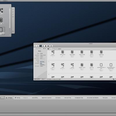
What's that tray icon with the arch logo?
archassistant
Dude, you should share your bespin settings.
thx, sure man, I'll upload them with the next release :) I wasn't gonna update this but the positive impact this seemed to have on people I decided to change my mind :)
Thx :) Will wait for update.
Working on this wallpaper I've never thought someone will use it wherever. Now I know: if there is suitable plasma theme everything looks more more better! Just improve the clock & eliminate potential errors - it will rocks for real! :) Great work generally! With wishes - Podstavsky.
Wow , thx man! Didn't expect a hot-shot artist to even bother looking at this :D Really like your icons man, they are really great! Wish I had that kinda talent, well, anyways, the wallpaper is very nice, I don't get it why you're saying you didn't expect users to use it??!?! I'm also a huge fan of the smooth-cleanish-air desktop, it has become what aero is for windows and aqua is for mac, THE gui style for linux, that is what linux has been missing in my opinion, a definitive style that people connect with linux. The thing I like about your wallpaper is the clean smooth circles, I dunno why, but I somehow seem to love circles :D while still, having the "air" look to it, I hope you will keep on improving the wallpaper in the future, I dunno, maybe more circles or blurred circles mixed with..... I dunno,, just an idea :) Oh?!?!? you didn't like my clock?? why not? it's the best there is!! hehehe, just kidding, I know it sucks, I didn't even mean to do a clock at first but when I saw your wallpaper I got an Idea from the circles :) ofc I will improve it okey, enough of my mindless blabbering. //Robert
>>Didn't expect a hot-shot artist to even bother looking at this :D ** You gotta be kiddin! :D Me and the hot-shot? Look at your ideas. I think you're too modest :) Nah - it's beautiful, cause it looks well - everyone will say that ;) >>Really like your icons man, they are really great! ** THX for the recognition :) >>Wish I had that kinda talent, well, anyways, the wallpaper is very nice, I don't get it why you're saying you didn't expect users to use it??!?! **Oh - you have talent - everyone loves the "new-theme" plasma suites! And I'm a big fan of them! Constantly improve your work effects (no - they're not ugly or sth - sometimes the tone transitions need to be reworked or from ver. to ver. everyone add a new element)! When I saw the #1 theme I thought: "Oho! Here it comes - a new plasma big bang". Just love "soft" colours, glow or smooth taskbar backgrounds etc. Now I use #2 - the clock in my desktop is camouflaged :D >>THE gui style for linux, that is what linux has been missing in my opinion, a definitive style that people connect with linux. ** That's right! Using a new OS for the first time everyone looks at the desktop graphic suite. Not everyone see the advantages that GNU/Linux have (or BSD). Only one way in most cases is to improve the look and then show the merits! Did you hear about one funny test? A group of men in one town (I did not remember which one) was walking carrying laptop with KDE4 and telling examined people: "That's new Win";"Do you like this widget"; "Look at the cube"; "Hope you like this..." etc. You know what? Most of them said that they will install the "new Windows" on their machines because it's very useful, good looking etc. Everyone can guess what will go wrong if you say at first sentence: "It's Linux and it's new KDE4 desktop"... >> The thing I like about your wallpaper is the clean smooth circles, I dunno why, but I somehow seem to love circles :D **Thanks once again! I will use every circle-idea to improve each square inch of next wallpaper candidate :) >>Oh?!?!? you didn't like my clock?? why not? it's the best there is!! hehehe, just kidding, I know it sucks, ** As I said - the idea was not bad - nothing like this. The clock was made for the background - and it's the best suitable element! Saying: "improve the clock" I meant rather technical aspects. Bold the min/hour indicators or add a red stroke to the interior circle that the second indicator is attached! And that's all! The clock will be just a little legible :) >> my mindless blabbering. ** If there will be more mindless blabbering like this... Keep up the really good work! That's everything I can wish for now! :) With best wishes, Podstavsky.
I have to say WOW... (o no that was VISTA)... :( I Try again ;). I have to say REALLY NICE! I Like all of it and specially the window decoration. One of the best, I hope to test it tomorrow now I'm stuk on a Vista machine (not mine).