
Elegance
Source (link to git-repo or to original if based on someone elses unmodified work):
0.7:
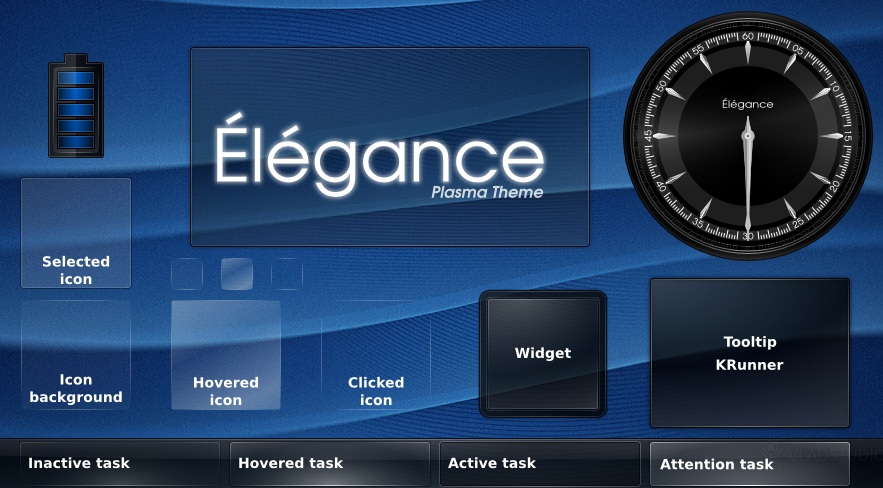
- New realistic clock!
- New background for widgets and dialogs (full SVG)
- Shutdown dialog improved
0.6:
- New panel background and tasks backgrounds (full SVG now)
- Shutdown dialog updated
- System tray background added
0.5:
- Updated clock so that it is well rendered now
- Adapted tasks for KDE 4.1
- Improved shutdown dialog
- Added translucent background and krunner panel
- Added corners to panel background
0.4:
- Colors config file updated
- Taskbar theme
- Logout window theme
0.3:
- Icon theme completed
- Clock and panel background improved
- Tooltips theme added
0.2:
- Clock theme
- Battery Monitor theme
0.1:
- widget background
- panel background
- icons theme
TODO:
- (opaque theme)
- containment-controls.svg






Ratings & Comments
67 Comments
For people using Plasma 5.16, you can restore the clock hands to be properly pinned to the center again like in KDE4, by adding this snippet before the final "" in the widgets/clock.svg file:
Sniff, the xml got simply wiped by the comment system on pressing "Send". See https://forum.kde.org/viewtopic.php?f=17&t=160651&p=416931#p416965 then instead
I put the whole updated clock here :·) https://www.pling.com/p/1320845/
10 Best clock ever
3 - it is for unsupported KDE4
9 Looks great on Plasma 5!
Hi, Thanks for this very nice theme, congratulations! However, I have some remarks :) 1) Some icons are missing (ex: amarok in the tooltip box). 2) Hovered and Attention tasks could shine a little bit more. Remarks related to (1) : - By default, elegance seems to use breeze as fallback. But breeze icons in the tooltip are just... not elegant :) Moreover, and some icons (like amarok) are missing. - One could specifically set another theme like air or oxygen. But here again, some icons are missing, like the checkboxes in network-manager panel. --- Debian stretch, elegance 0.7
Very good theme, my favorite, but i have a problem with light color buttons. Since elegance has a white font, some widgets (like translatoid) or other plasma components have some white or very light color buttons, so button's content isn't properly displayed there.
Hi, The following workaround will do the trick: Open /home/username/.kde/share/apps/desktoptheme/Elegance/dialogs/colors file. Find [Colors:Button] section in the file and set ForegroundNormal=x,y,z to a dark RGB number such as 0,0,0. Restart your computer and the buttons will be visible.
....but for one item. Even with the latest version (0.7) the shutdown dialogue does not display correctly. All other themes that I have installed display the correct width, thus the graphic (ie. the moon image is displayed). If it weren't for that I'd give it a 10, as it stands 9.5. Chees.
I really like the elegant theme on my system without compositing. The only problem is the "more" button on plasma notifications is light grey and the text that goes on it is also light grey, so it is unreadable.
I should have mentioned that I'm using KDE 4.3.1.
Okay, so I fixed the problem myself by copying the button pixmap from the BlackGlass theme (http://www.kde-look.org/content/show.php?content=110034). I also fixed the shutdown dialog for KDE 4.3. You can download my fix here: http://www.mediafire.com/?mzemmyzdhyt
when tray icons are hidden there should be an expander button on the left of the tray which there is not, though the functionality of expanding to show hidden icons does work if the area is clicked
The shuddown/logout dialogs in your theme are ugly. I don't know it's a bug in kde or your theme, but for me it looks like: http://img244.imageshack.us/img244/4012/screenshotn.png It would be a lot better if the picture was at the left of buttons.
Hey, I fixed it myself by removing the power logo from the dialog. My fix also corrects the problem where buttons were unreadable under KDE 4.3. Anyway, you can download my fix here: http://www.mediafire.com/?mzemmyzdhyt
Under kde 4.2 beta1 the svg's for the tasks seems to be broken. Is this a known problem?
the version distributed with the betas were out of date. The version of Elegance distributed with KDE 4.2 has been updated to match latest version here. This is a great theme, that looks great with KDE 4.2.
Personally, I liked the old clock better =)
Same here :P IMO the new clock is overwhelming. I really liked the old clock as it used to be simple and really nice ;)
One more vote for the old clock! It was plain and elegant, whereas the new one looks like a horror flick prop.
Elegance is my definitive choice of theme. Is, as the name implies, 'elegant' and very good looking. The only thing I would change too is the clock; it doesn't quite match the theme. A simpler clock, in black or dark background, maybe with some transparency would match better. Still, congratulations on a great work.
I very very like it! This background.svg is perfect! Very inspiring :)
I like 0.7 a lot better than the previous versions. Way nicer. And the analog clock is a nice touch, though somewhat messy if it's too small. Going to use it now and see if it will finally replace Oxygen. :)
One question: what font did you use in the pictures?