


Marbre
jmariani


Source (link to git-repo or to original if based on someone elses unmodified work):
20/09/15
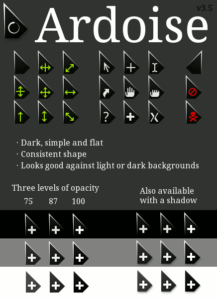
Reworked shadows for cleaner edges
17/02/15
moved to GitHub
all previous variants are now also available with shadows
the dark border at the bottom of the cursor was removed
18/01/15
added a more translucent variant, similar to previous versions. Thanks to janet.
31/10/14
fixed a visual regression in Wait cursor (the axis of rotation was slightly off-center and the symbol was poorly positioned).
27/10/14
improved uniformity (some symbols had a different opacity)
added Ardoise_opaque theme
added a script to regenerate files from source
06/09/14
slight alignment fix on up_arrow and col_resize
01/08/14
added link to source files and reduced file size
30/07/14
additional fixes, thanks again to dabbill
27/07/14
fixed some legacy symlinks that were mixed up, thanks to dabbill.
25/07/14
added ClosedHand cursor and markitos66 added legacy symlinks. The theme should now work properly on Gnome and other DEs.
18/07/14
all cursors have been completely redrawn, keeping the original appearance but with a slight alteration to make them look better on bright backgrounds. The Wait cursor is now clockwise.


Other Cursors:


Ratings & Comments
34 Comments
Is it possible to get .PNG versions of this cursor so it can be used with Windows? Thanks.
Hi, I have added new downloads for every variant containing high-resolution png exports of every file. I hope this is what you needed.
This is what I was looking for. Thank you for posting the additional files so quickly!
8 I would just change the color green to white, to be standardized. Besides, it is excellent!
Thanks for the comment! See my reply to bloodraven below. You could edit the value "highlightColor" (where currently green) in custom.replace to get the result you want.
10 10 the best Simple and sleek, the best cursor I've seen. The fact that the bonus icons are inside the cursor and don't change its silhouette/point location is so innovative and nice! 10/10
Could you perhaps make a grey version? It does sometimes get lost in black backgrounds, being purely black itself, the transparency doesn't help. That's my only complaint.
Thanks for the kind words! I can look into making it easy to customize so you can select the color you want.
Alright, I reworked to source code to add the ability to easily generate themes with custom colors. If you want to do that, you will need git, Inkscape >= 1.0 (it won't work with earlier versions) and xcursorgen. Clone the code and go to the 'assets' folder: $ git clone https://gitlab.com/obnosim/ardoise.git ardoise $ cd ardoise/assets Edit the file 'custom.replace' to give it the color values you want. To change the color of the cursor body, edit the values 'bodyGradientStart' and 'bodyGradientEnd'. Then, generate the theme (still from the 'assets' folder): $ ./regenerate custom This will use the values in 'custom.replace' to produce a new file in the parent folder: 'Ardoise (custom).tar.gz'. You can then extract this archive either in '~/.local/share/icons' or in '/usr/share/icons', then select it from System Settings > Cursors.
10 One of my favorites. Been using this one for a long time!
Cheers!
This is the best cursor I have ever used. Very elegant, yet simple.
Thanks!
Love this cursor with a passion. It goes wonderfully with my custom Linux Mint Cinnamon theme. Well done. :)
Glad you like it! :)
I love this theme but the x-cursor does not look very Ardoise-like, maybe you could replace it? And can you please add a pirate cursor? Something like this maybe (that's the Breeze pirate on Ardoise cursor): http://www.fotos-hochladen.net/uploads/pirate72ews8yncfkx.png
I didn't customize those two because I honestly don't know what they are there for and I have never encountered them (I kept the default x_cursor one but the pirate one is missing, I'll fix that). I could create Ardoise versions if it's a problem (see my answer to your previous comment).
The pirate is for xkill!
Okay, the two new icons are ready. I'm waiting for you to tell me what opacity you'd like and I'll publish the update.
I just updated to Ardoise (translucent) from former Ardoise and I am somewhat disappointed to see that the so called translucent Ardoise theme is less translucent than the former Ardoise theme and nearly black instead of the elegant anthracite. Can you please please please add a third version with the old translucency and color?
I have been using the translucent variant continuously since the beginning and I have not noticed that change. But I can make a more translucent one, no problem. Take a look at translucent.svg in the sources and tell me what % you would like. It's applied to the groups that contain the edge and the background, and it's currently set to 87.5%.
It's difficult to tell which %. Maybe it wasn't a change in the group-% but inside the group? I guess you don't have and older svg? You have done something to the translucency for some of the pointers in the file, in the old version some pointers were dark (like the translucent theme now) and some, especially the left_ptr, were lighter. You adjusted something for consistency... I'd have preferred if you would have made the darker ones lighter and not the lighter ones darker... Maybe you remember what you did? It really would be great. Thanks for your efforts. Here are the two left_ptr files, I prefer the translucency of the "org" one. If you don't trust your eyes use cmp ;) - they really differ. http://kerridis.de/temp/ardoise-old-new.tar.gz
Call me petty, but the text under the cursor is better recognizable with the old version: http://kerridis.de/temp/ardoise-old-new.png
There you go! I added a new theme similar to the older one (Translucent 2). I think you were right about the change coming from the way the elements were layered. The 87.5% multiplier was incorrectly applied twice on some cursors and at some point I fixed it.
Thanks a lot!! :)